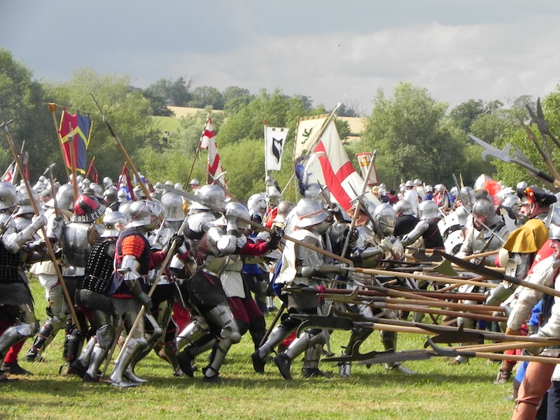
Medieval battles were messy and confusing affairs where people basically were dressed as human can openers. The goal was to harm as many of the opposite side without harming your own. This is why early forms of heraldry and branding were created.
The last thing you wanted to do was hit someone on your own side.
So knights adorned themselves with bright colors and designs that reflected their family history, location, and other identifiers that told very quickly their story.
In tournaments, the knights would advertise their abilities further strengthen their brand. Think of how commercials work today just minus the violence.
Even samurai had their own branding. These marking would demonstrate their allegiances.
So the concept of branding and logo design has its roots from very ancient origins and served very important purposes.
The key to understanding logo design is understanding that logos create a sense of unity and community. That's why the first logos are used to target or represent as specific group.
But logos should also beyond representing a group should be eye catching.
The logo should be appropriate for who you are representing.
The logo should not cause confusion. It should be clearly different so you can create contrast to what already exists.
Trends come and go kind of like slang language. Who still uses the words "beast." "tubular," or "epic." If you do we need to have a long discussion about more than just logos lol. However, back to focus remember what you find cool now, may not be cool years later. Think back on the music you "used to listen to."
Simplicity avoids confusion which is critical in design.
Logic like logos needs to demonstrate consistency. If an idea is inconsistent then it wont ring true.
Balance enhances readability, and makes us feel more comfortable. The idea feels more palatable as it feels more stable. We associate instability with nervousness or in the extreme insanity. Consider this when you get into a plane or car you are trusting a brand with your life. Do you want to associate it with nervousness? While this is an important design rule, sometimes rules can be broken. With the proper justifications design rules can be broken! Test...test...and test.
Use the preconceived notions of shapes to help your design. There is a reason we feel the way we do about shapes. Exploit those feelings to use shapes as part of your design language.
Type is voice!
Type is voice!
Type is voice!
Design is all about efficiency make the most of it!
Colors = information. That's it. They expedite a message quicker. It's like adding a turbo boost to a underlying concept. Choose wisely and keep color choices to a minimum. Remember try to use two colors or less... unless you are marketing something Ebay or Google.
What an exciting time to be alive with all of our evolving technologies, but as a result this creates design challenges. Your design needs to flexible. How does your logo for you brand look on the side of a blimp? What about on a website or t-shirt? How does it look on a smart watch?
Flexibility is critical!