Sunday, May 7, 2017

The human face: The EYE


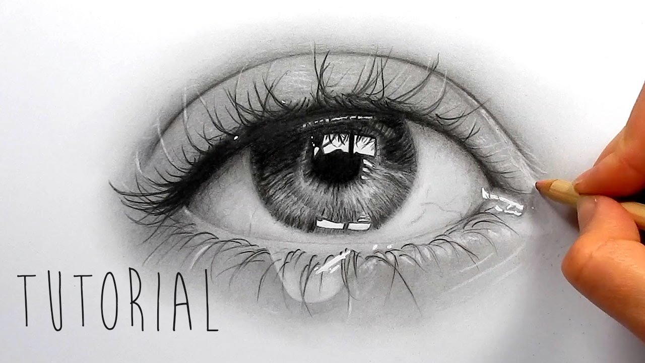
This week we are furthering our study of the human face. One the first things people are drawn to (excuse the pun) are the eyes on the human face. The eyes tell us a story.


It's important to understand a little bit about the anatomy of the human eye.


The key areas for us to understand as artists are...

  • Pupil...This is the part of the eye that allows light in. It is the darkest part of the eye and adjusts based upon the amount of light and emotions. The more scared one feels or angry the smaller the pupil becomes. The more loving or happy someone is the larger the pupil.
  • Iris...This is the part of the eye that has color. This will differ from person to person. Typical colors are brown, hazel, blue, and green. However, these colors will very greatly depending on a variety of factors. First, not all colors have the same vibrancy from person to person. Also, metamerism may effect how the color appears. Metamerism is how light effects a color.
  • Sclera...This is the not white part of the eye that is a very light flesh tone.         
  • Reflected light is how we know the subject is alive. The reflected light gives the subject a soul. The reflected light also is a byproduct of the moisture that eyes naturally have.


Above and below are some good notes for drawing eyes.


Here is a good practice eye that if you draw you can earn extra credit for.


Friday, April 28, 2017

Introduction to Color Theory!


 Color can be very complicated. So it is important to understand how we see color. 


We all need the same thing to see color... light! This is why when artists say, "Value is more important color." What we are talking about is the value of the light source. How bright is the light? Without light you can't see color at all. There are varying degrees between full lit and darkness that affect our ability to see color. 


The rods in our eyes are sensitive to light and dark, and the cones are sensitive to color. Males tend to have more rods in their eyes, and females tend to have more cones. So ladies please forgive us males if our color choices are strange. In fact, men are much more likely to be colorblind that females. Some estimates have 1 out of 12 males being somewhat red/green colorblind.

Ok... so what does this color blindness look like? Why is it important to art? Many famous artists are color blind who use color. We will explore that later, but what do they actually see?


It is important that light can damage your cones and rods which is why you should not stare directly at the sun. Every time you blink you are essentially rebuilding your cones and rods. If spots continue it could be indicative of permanent eye damage or serious illness. 


So while our cones and rods act as the receptors it's very important to recognize what enables us to absorb light into the cones and rods. That is the function of the pupils. The pupils are the darkest part of the eye. The reason the pupils are black is that black absorbs more light than other types of color. Black is really not a physical color but a description of all the physical colors combined. So if you took all the colors in your color pencils or paint in your box and mixed them together you would get a black. We also know black absorbs more light by walking from the beach on to asphalt. Asphalt will be hotter than beach sand because it is dark it absorbs more light. 


Pupils also serve an emotional purpose as well. The larger the pupils appear the more loving or accepting someone will appear. The smaller the pupils the person or animal will appear angry or frightful. Our pupils contract not only to allow light, but show how we feel. 


It's important to break color up into three descriptions...

Hue is the name of a color.

Saturation is the amount of a color.

Value is how light or dark the color is. Again, value is the most important element of color!

This is your basic color wheel with a basic description of hues.


A more advanced color wheel will explain how colors are mixed, temperature, and compliments and analogous colors. 

Complementary colors are opposites on the color wheel. 


Analogous colors are colors that share a relationship on the color wheel due to proximity. For example, red, red violet, and blue violet would be analogous colors. Think of analogous colors as the friends who would hang out because they have something in common. 

Primary colors for example can't be mixed, but are used create secondary colors. 


Again keep referring back to the color wheel. 


The beauty of color theory while it's rooted in very sound theory observing it is always evolving because light is always changing. So you can never get bored with it! It's like a radio station with a new hit song every time. How cool is that?



Monday, April 3, 2017

Rubric For Final Children's book Project


Your original image should be placed upon 9in by 12in paper. (You may work larger if necessary.)


There should be a 1in border around the image. 

The image should reflect all the design principles as defined by your syllabus and gone over in class. 
A particular focus will be on value since it was the major theme this unit.)

You will be graded on how you used reference.

Your final image must be reflective of the book that you’re presenting for.

The final is due April 13th.


Children's Book


It's that time to wrap up our final children's book images. Again what we are looking for is a reinterpretation of what was created before. What this means is that you read the text, and create a new image based upon what the book makes you think and feel. 


There are a lot of ways of looking at the same thing. Maurice Sendack's Where the Wild Things Are is a wonderful story, but has more than one way it can be looked at. 
Visually it has been explored by film and children's books and will continue to be so. 


However, many people have personalized this book because it had a special meaning. As culture and time pass so does meaning and interpretation. It is important the newer work reflect this. This is why you see older stories reinterpreted all the time. Here are some examples of reinterpretations of Where the Wild Things Are.


All of these have a much more modern feel so how are you transforming your story to reflect you? How does your interpretation reflect your audience?

Wednesday, March 29, 2017

Tight Sketches

The question of what is a tight sketch is often asked by young artists. The tight sketch is exact blueprint you will base your final image on. 


YOU DON’T WANT YOUR HOME BUILT WITHOUT A BLUEPRINT!!!


In the design process, we usually begin with mind maps and thought trees to get our ideas. Once we have finished our mental exploration, it is important to visually explore our ideas. The initial visual explorations are called thumbnails or thumbnail drawings.


Thumbnail drawings are quick gestural sketches that are meant to get our ideas on paper. These usually are imperfect, hastily drawn images taking no longer than 5 minutes that allow the artists to quickly see how their ideas are forming. Thumbnails sketches also inform the artist on what exactly they need to research for their final product.


The difference between a tight sketch and a thumbnail is that tight sketches can take up to an hour or even longer. At this point, the artist should have amazing reference that they are testing out. The composition of the piece should have been already decided based upon the thumbnail work. 


After a tight sketch you can explore colors.


So, all the elements of design are pretty much decided, what is important is to see what the components are going to look like together. Even more important, the artist is going to test the value. Without testing the light sources the final blueprint for the final image will be for nothing. No amount of color will save bad value. The tight sketch is the key to a successful final image.


Thursday, March 2, 2017

Flight Check List!


 Flying is one of the safest modes of transportation. So as artists we can learn from the success of the airline industry of how we can take our product from where it starts to how it gets to its destination. 


Review the checklist below to make more successful art!