Friday, January 13, 2017

Introduction to Value...Frank Miller


Frank Miller revolutionized the comic book industry by actually saving it from economic collapse. Entertainment powerhouses like Marvel and DC were on the brink of bankruptcy. 


One of the major comics in his career that he did before saving the entire industry was the revolutionary 300. It was a blend of historical fact mixed with comic book flair and artistic license to create a dramatic account of the Battle of Thermopyle.


The graphic style and dramatic storytelling would eventually capture the attention of Hollywood, and debut the famous movie director, Zach Snyder.


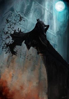
What he is most famous for is evolving one the most important comic book characters of all time,..Batman.


Batman was originally closer in design to a literal bat. 


Some of the early Batman depictions look like hooded pajamas with a cape and safety belt. 


As a result of designs that didn't represent a darker and more complex world comic book sales began to decline. So Frank Miller said, he wanted to write and draw a more realistic and brutal Batman story that would reflect the effect of years of crime fighting.


The result was the Dark Knight Returns. Frank's sharp value style added intensity and edge that resembled the grittiness of the movies and news at the time. 


The elevated drawing style was a departure from typical cartoony comic books and encouraged fine artists and other famous illustrators to try their hands at comic books too.


Artist's inspired by Miller's work...


Don't forget to draw your two value Batman!


Wednesday, December 21, 2016

Thursday, December 1, 2016

User Experience


One of the most important things to think about is how are people going to interact with your poster. These people are called "users" and you need to think about what experience your poster will evoke with them. 


Your poster should have a focus. We call this a target. You are trying to grab a specific audience so you aren't wasting your time, money and energy. Marketing for products are often carefully designed to meet the needs based upon the demographics. 

Creating work for specific groups works, and evidence is the billions spent each day on getting people to purchase the next thing. What works for toddlers will not necessarily work for teenagers, or the elderly. So it is critical that there is a design awareness for what the product is for and whom it is intended to use it. 

Culture isn't only based upon factors such as religious backgrounds or different nationalities. Culture could also be an example of what is trending and what isn't. For example words used just three years ago may not be used today. It is important to have the design awareness to know what to use so you don't offend your audience, or turn them off by being lame. 

Below are examples of posters for very different demographics. Therefore the intended UX is varied.


Monday, November 14, 2016

Gig Posters


Gig posters are what bands use to get their fans in the door. What they are not is album or CD covers. The point of gig posters is to sell the music of your favorite band to a specific demographic. 


Gig posters are part of the life blood of the modern music era as current technological trends make touring more important than music releases. Bands make most of their money from their shows versus track sells. Often bands don't even control what goes on their album or CD covers because they technically don't own the music. It is the music publishers that do. What makes gig posters special is bands or recording artists do control the gig posters. There is a direct relationship between artwork, the fans, and the musicians in gig posters.


 You are to select your favorite band, rapper, recording artist, or orchestra and begin designing thumbnails based upon your love of their music. Remember it is your job to demonstrate your knowledge of their music visually while trying to create new fans. 


Friday, November 4, 2016


The homework this weekend is to find your favorite musical artists. You are to narrow your choices to 3 possibilities. This will require you to listen to music. So listen and prepared for Tuesday!

Tuesday, October 25, 2016

Logo Project is Due November 3rd


  1. Remember you are to design a logo for your business. 
  2. Your business are the noun and adjective you pulled out of the helmet.
  3. Your logo should reflect the product and services for your company that were agreed upon by you and Mr. Ferrell.
  4. Your logo final logo should have at least 10 thumbnails sketches. 
  5. You should test your colors.
  6. The final needs to be on a 9x9 inch square piece of paper with a one inch border.
  7. Your final design needs to be pre-approved by your client. (Mr. Ferrell)
  8. You will be graded according to the rubric provided on the syllabus.