Color can be very complicated. So it is important to understand how we see color.
We all need the same thing to see color... light! This is why when artists say, "Value is more important color." What we are talking about is the value of the light source. How bright is the light? Without light you can't see color at all. There are varying degrees between full lit and darkness that affect our ability to see color.
The rods in our eyes are sensitive to light and dark, and the cones are sensitive to color. Males tend to have more rods in their eyes, and females tend to have more cones. So ladies please forgive us males if our color choices are strange. In fact, men are much more likely to be colorblind that females. Some estimates have 1 out of 12 males being somewhat red/green colorblind.
Ok... so what does this color blindness look like? Why is it important to art? Many famous artists are color blind who use color. We will explore that later, but what do they actually see?
It is important that light can damage your cones and rods which is why you should not stare directly at the sun. Every time you blink you are essentially rebuilding your cones and rods. If spots continue it could be indicative of permanent eye damage or serious illness.
So while our cones and rods act as the receptors it's very important to recognize what enables us to absorb light into the cones and rods. That is the function of the pupils. The pupils are the darkest part of the eye. The reason the pupils are black is that black absorbs more light than other types of color. Black is really not a physical color but a description of all the physical colors combined. So if you took all the colors in your color pencils or paint in your box and mixed them together you would get a black. We also know black absorbs more light by walking from the beach on to asphalt. Asphalt will be hotter than beach sand because it is dark it absorbs more light.
Pupils also serve an emotional purpose as well. The larger the pupils appear the more loving or accepting someone will appear. The smaller the pupils the person or animal will appear angry or frightful. Our pupils contract not only to allow light, but show how we feel.
It's important to break color up into three descriptions...
Hue is the name of a color.
Saturation is the amount of a color.
Value is how light or dark the color is. Again, value is the most important element of color!
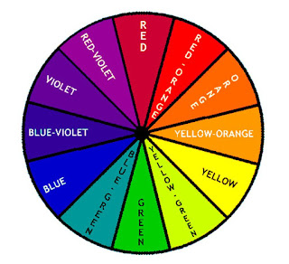
This is your basic color wheel with a basic description of hues.
A more advanced color wheel will explain how colors are mixed, temperature, and compliments and analogous colors.
Complementary colors are opposites on the color wheel.
Analogous colors are colors that share a relationship on the color wheel due to proximity. For example, red, red violet, and blue violet would be analogous colors. Think of analogous colors as the friends who would hang out because they have something in common.
Primary colors for example can't be mixed, but are used create secondary colors.
Again keep referring back to the color wheel.
The beauty of color theory while it's rooted in very sound theory observing it is always evolving because light is always changing. So you can never get bored with it! It's like a radio station with a new hit song every time. How cool is that?


